Client
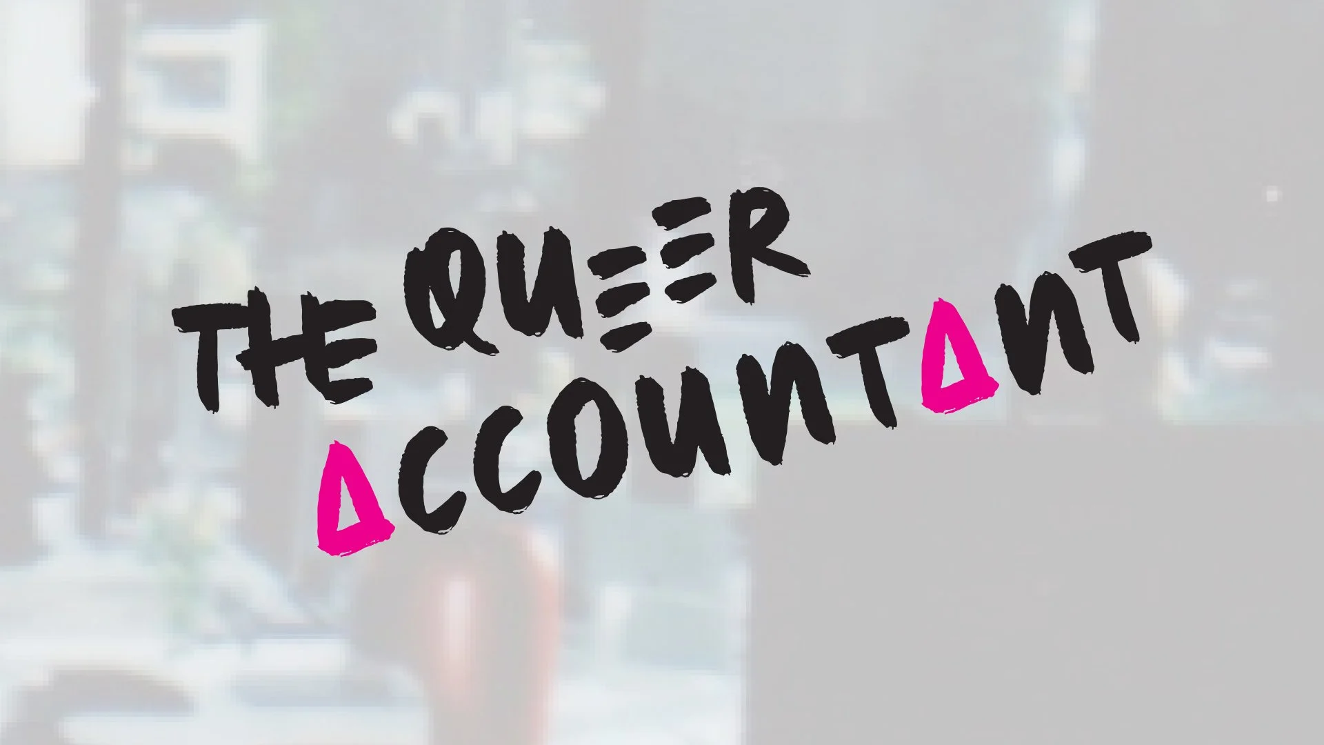
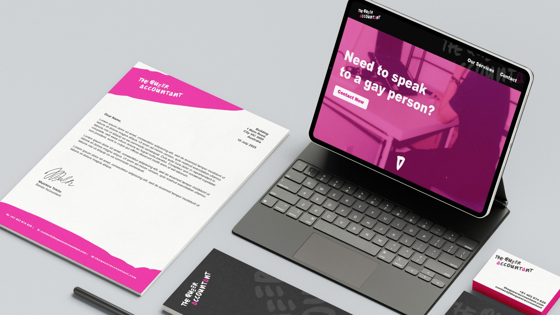
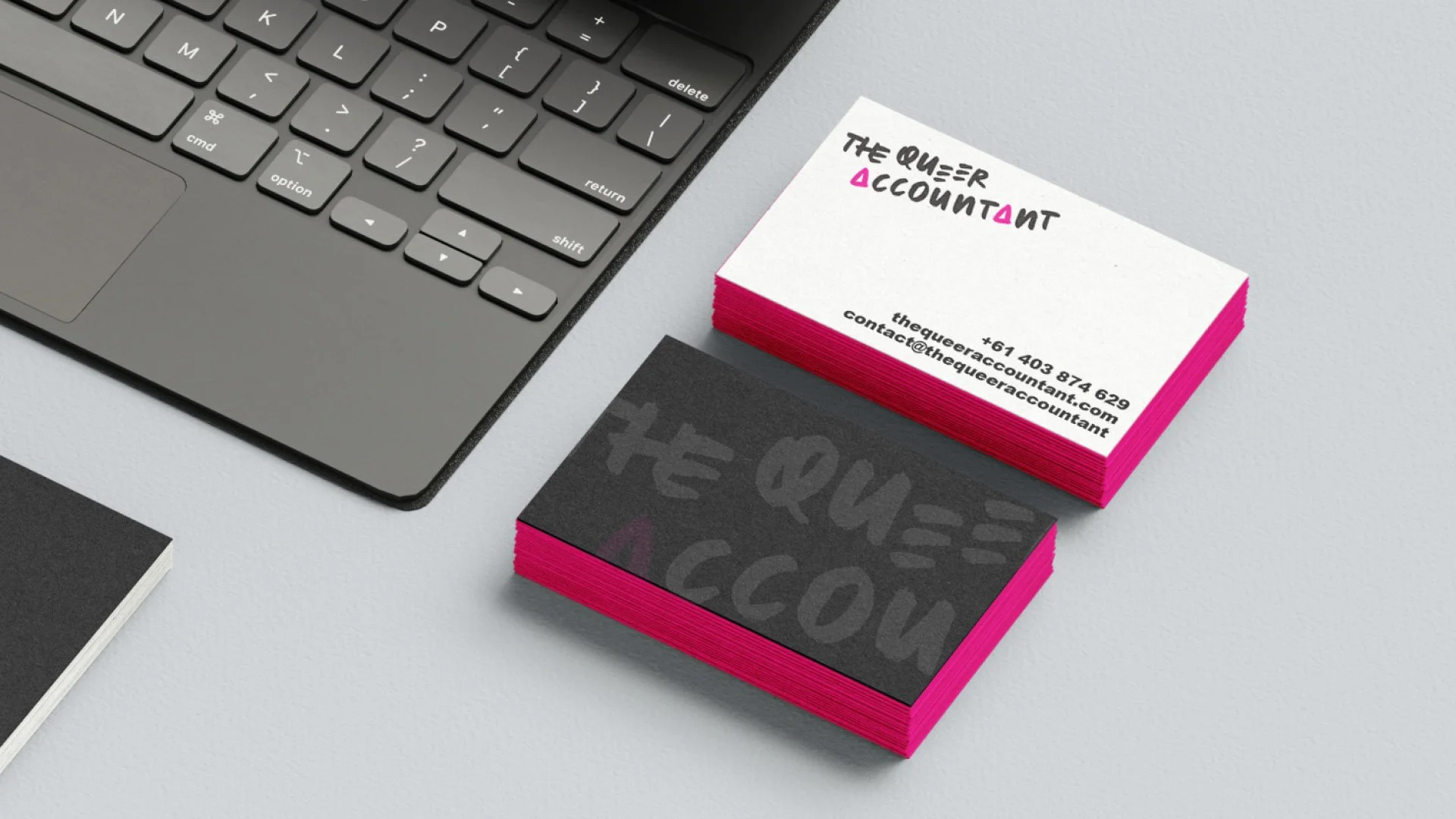
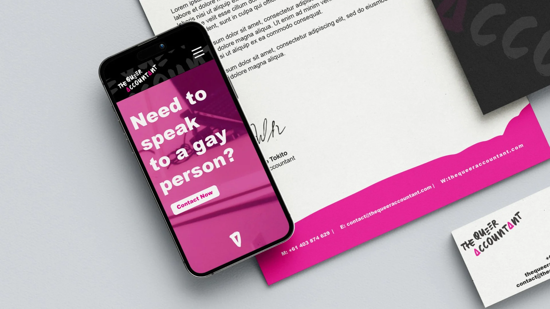
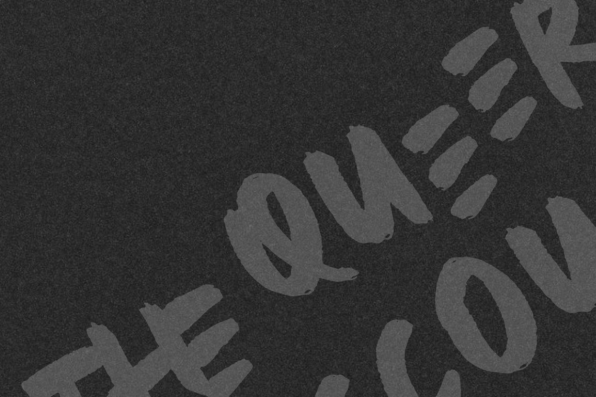
The Queer Accountant
Creative, Digital & print design
The Queer Accountant leans heavily into queer culture, we wanted the branding and language used to speak to an LGBTQIA+ clientele to create a more approachable and less corporate feel.